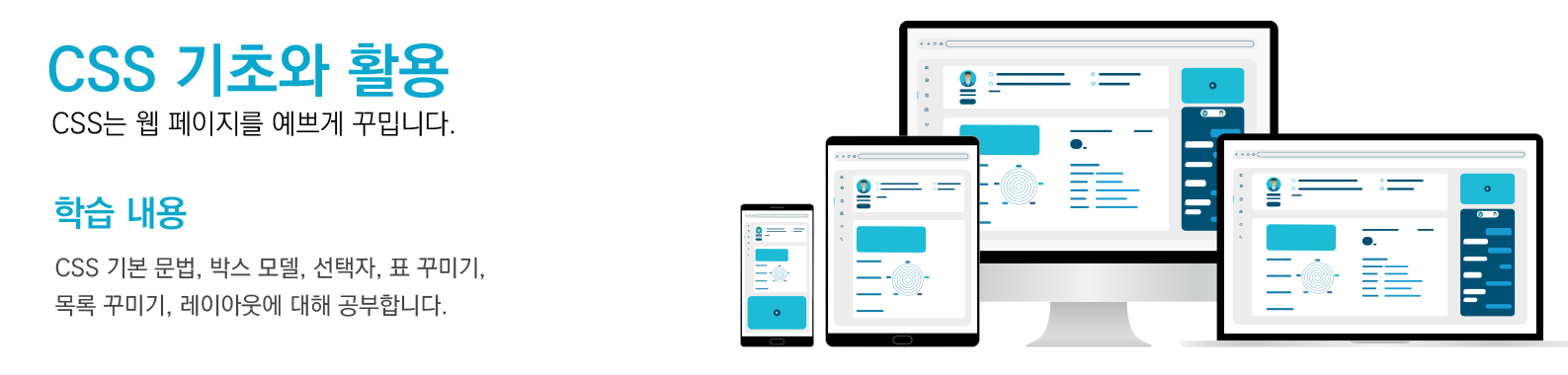
3-1. 헤더 모듈
■ 상단 헤더 모듈 - Type 1
✅ 구성 요소
1. 좌측: 로고
2. 가운데: 네비게이션 메뉴
3. 우측: 로그인 버튼
화면 크기에 따라 레이아웃이 적절하게 수평 → 수직으로 변합니다.
ex3-1.html의 실행 결과
상단 헤더 모듈 - Type 1
ex3-1.html
<!DOCTYPE html>
<html lang="ko">
<head>
<meta charset="UTF-8" />
<meta name="viewport" content="width=device-width, initial-scale=1.0"/>
<title>반응형 웹 페이지</title>
<style>
* {
box-sizing: border-box;
margin: 0;
padding: 0;
}
body {
font-family: 'Segoe UI', sans-serif;
background-color: #f4f4f4;
}
header {
background-color: white;
box-shadow: 0 4px 8px rgba(0,0,0,0.1);
padding: 1.5rem 2rem;
text-align: center;
}
.logo {
font-size: 2rem;
font-weight: bold;
margin-bottom: 0.5rem;
color: #333;
}
nav {
margin-top: 1rem;
}
.nav-menu {
display: flex;
justify-content: center;
flex-wrap: wrap;
list-style: none;
gap: 1.5rem;
}
.nav-menu li a {
text-decoration: none;
color: #555;
font-weight: 500;
padding: 0.5rem 1rem;
border-radius: 5px;
transition: background 0.3s, color 0.3s;
}
.nav-menu li a:hover {
background-color: #4CAF50;
color: white;
}
@media (max-width: 600px) {
.nav-menu {
flex-direction: column;
gap: 0.75rem;
}
.nav-menu li a {
display: block;
}
}
</style>
</head>
<body>
<header>
<div class="logo">GreenStudio</div>
<nav>
<ul class="nav-menu">
<li><a href="#">홈</a></li>
<li><a href="#">서비스</a></li>
<li><a href="#">블로그</a></li>
<li><a href="#">연락처</a></li>
</ul>
</nav>
</header>
</body>
</html>
✅ 반응형 작동 방식
- 데스크탑 : 로고 / 메뉴 / 로그인 버튼이 수평 정렬.
- 모바일 (768px 이하) : 위 → 아래 방향으로 재배치.
메뉴가 수직으로 변경되고, 로그인 버튼은 맨 아래 우측 정렬됩니다.
■ 상단 헤더 모듈 - Type 2
✅ 구성 요소
1. 왼쪽: 메뉴 아이콘 or 링크들
2. 중앙: 로고
3. 오른쪽: 로그인 또는 사용자 아이콘
화면이 좁아지면 위아래로 자연스럽게 재배치됩니다.
ex3-2.html의 실행 결과
상단 헤더 모듈 - Type 2
ex3-2.html
<!DOCTYPE html>
<html lang="ko">
<head>
<meta charset="UTF-8">
<meta name="viewport" content="width=device-width, initial-scale=1.0">
<title>반응형 웹 페이지</title>
<style>
* {
box-sizing: border-box;
margin: 0;
padding: 0;
}
/* 상단 모듈 스타일 */
.top-header {
display: flex;
justify-content: space-between;
align-items: center;
padding: 1rem 2rem;
background-color: #333;
color: white;
flex-wrap: wrap;
}
.logo {
font-size: 1.5rem;
font-weight: bold;
}
.nav-menu {
display: flex;
gap: 1rem;
list-style: none;
padding: 0;
margin: 0;
}
.nav-menu li a {
color: white;
text-decoration: none;
padding: 0.5rem;
transition: background 0.3s;
}
.nav-menu li a:hover {
background-color: #555;
border-radius: 5px;
}
.login {
background-color: #4CAF50;
color: white;
border: none;
padding: 0.5rem 1rem;
border-radius: 5px;
cursor: pointer;
}
@media (max-width: 768px) {
.top-header {
flex-direction: column;
align-items: flex-start;
}
.nav-menu {
flex-direction: column;
width: 100%;
margin-top: 0.5rem;
}
.login {
margin-top: 0.5rem;
align-self: flex-end;
}
}
</style>
</head>
<body>
<header class="top-header">
<div class="logo">로고</div>
<ul class="nav-menu">
<li><a href="#">홈</a></li>
<li><a href="#">소개</a></li>
<li><a href="#">서비스</a></li>
<li><a href="#">연락처</a></li>
</ul>
<button class="login">로그인</button>
</header>
</body>
</html>
✅ 반응형 작동 방식 및 디자인
- 로고를 중앙 정렬해 브랜드 아이덴티티 강조.
- 좌우에 필요한 링크나 아이콘 배치 가능.
- 반응형에서 모든 항목이 수직으로 정렬되어 모바일 친화적.
■ 상단 헤더 모듈 - Type 3
✅ 구성 요소
1. 전체 페이지 상단에 카드형 헤더
2. 중앙에 로고 + 하단에 네비게이션 메뉴
깔끔하고 단정한 느낌, 단일 컬럼 중심형 UI에 적합합니다.
ex3-3.html의 실행 결과
상단 헤더 모듈 - Type 3
ex3-3.html
<!DOCTYPE html>
<html lang="ko">
<head>
<meta charset="UTF-8" />
<meta name="viewport" content="width=device-width, initial-scale=1.0"/>
<title>반응형 웹 페이지</title>
<style>
* {
box-sizing: border-box;
margin: 0;
padding: 0;
}
header {
background-color: #222;
color: white;
padding: 1rem 2rem;
display: flex;
justify-content: space-between;
align-items: center;
flex-wrap: wrap;
}
.left-items,
.right-items {
display: flex;
align-items: center;
gap: 1rem;
}
.logo {
font-size: 1.6rem;
font-weight: bold;
text-align: center;
flex: 1;
}
a {
color: white;
text-decoration: none;
padding: 0.5rem;
transition: color 0.3s;
}
a:hover {
color: #4CAF50;
}
.login-btn {
padding: 0.5rem 1rem;
background-color: #4CAF50;
border: none;
border-radius: 5px;
color: white;
cursor: pointer;
}
@media (max-width: 768px) {
header {
flex-direction: column;
align-items: stretch;
}
.left-items,
.right-items {
justify-content: center;
margin: 0.5rem 0;
}
.logo {
margin: 0.5rem 0;
}
}
</style>
</head>
<body>
<header>
<div class="left-items">
<a href="#">메뉴1</a>
<a href="#">메뉴2</a>
<a href="#">메뉴3</a>
<a href="#">메뉴4</a>
</div>
<div class="logo">로고</div>
<div class="right-items">
<a href="#">1:1 고객문의</a>
<button class="login-btn">로그인</button>
</div>
</header>
</body>
</html>
✅ 반응형 작동 방식 및 디자인
- 중앙 정렬 : 로고와 메뉴가 가운데 정렬로 배치되어 브랜드 강조
- 카드 느낌 : 그림자(box-shadow)와 흰 배경으로 카드 느낌
- 모바일 친화적 : 작은 화면에서는 메뉴가 세로로 전환